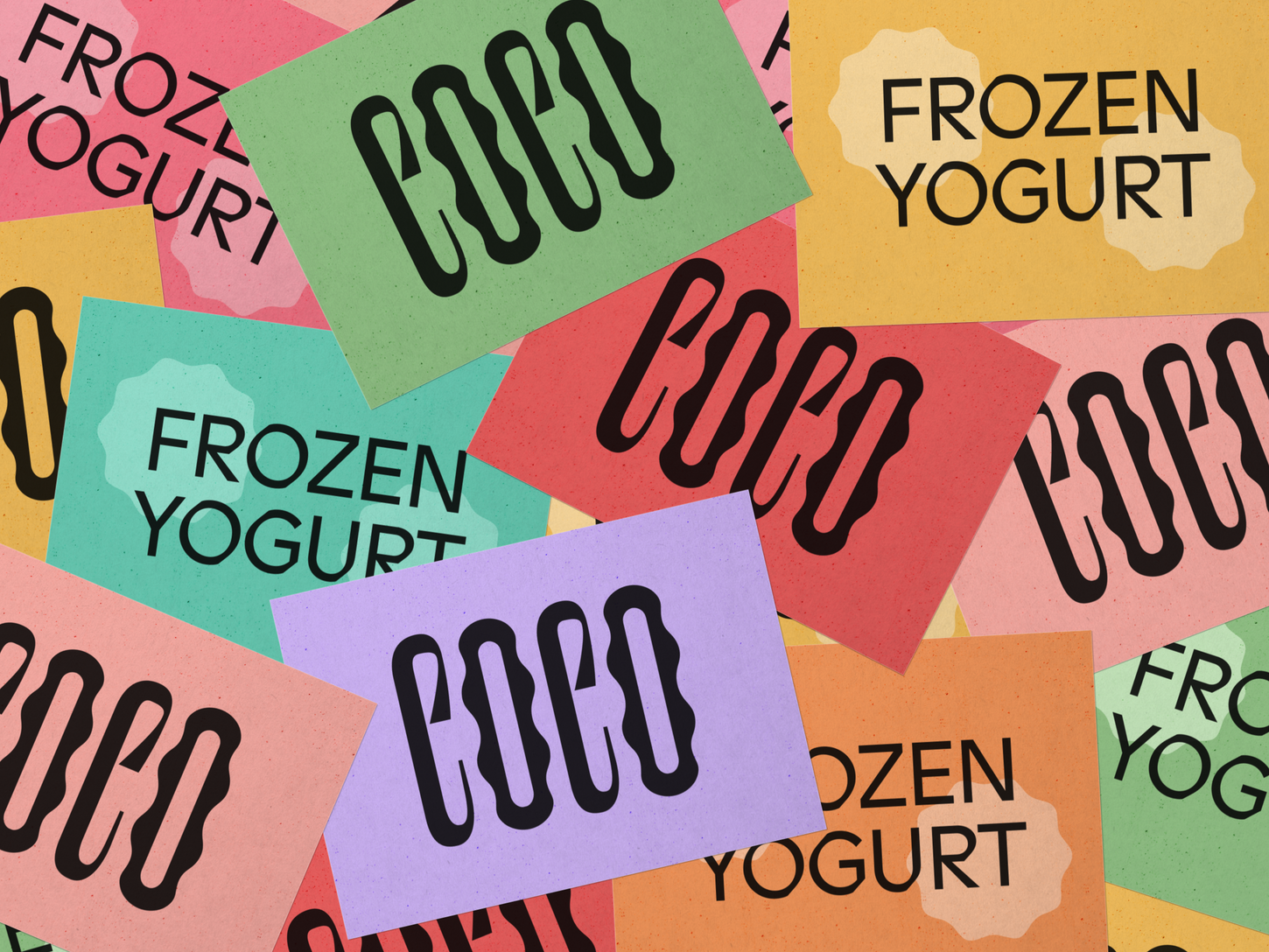
Coco Frozen Yogurt
Coco is a brand of frozen yogurt that comes in 8 exciting flavours. The branding for Coco is inspired by fun unconventional typography. It is led by a strong elegant logotype and a single visual element. The chosen visual element can be used in dynamic ways, keeping the overall brand language minimal but exciting. The logo’s elegance comes from its height and the stability of its shapes giving it the flexibility to adapt to different sizes. The bright flat colours with large black text creates a powerful contrast and the pastel shades add a sense of softness to the design. In addition, the typography combines warm calligraphic curves with a clean, machine-like sensibility—bridging the hand-drawn and mechanical genres.
Features - World Brand Design, Pentawards, Packaging of the World
Client - Personal Project Year - 2021


